Source: Facebook
For generations, many of us have grown up looking at the world through a map that made Africa appear smaller than it really is.
On classroom walls, in textbooks, television studios, and even on the digital maps many of us use today, Africa has often appeared smaller when compared with other continents. In actual fact, Africa is the second-largest continent, covering approximately 30.3 million square kilometres, behind Asia, which covers about 44.5 million square kilometres.
For years, the way the world was visually presented on maps created a distorted understanding of the actual size of continents. Generations have grown up with this representation without necessarily questioning what they were seeing. Now, the United Nations has taken a significant step toward correcting that visual imbalance.
On September 4, 2026, the UN General Assembly voted overwhelmingly to encourage countries, schools, international organizations, and technology companies to move away from the traditional Mercator projection and consider maps such as the Equal Earth projection, which represent the relative size of continents more accurately. The resolution passed 164-1, with six countries abstaining. Togo led the African campaign, with support from the African Union and other countries.
While the vote does not ban the Mercator map or legally require every country to replace it, the resolution encourages governments, schools, international organizations and technology companies to use Equal Earth and other equal-area projections where accurately representing relative size is important.
As noted by Togolese Foreign Minister Robert Dussey in an interview with Reuters, “A fair world begins with a fair map.” He further noted that “a map is never neutral” because it shapes perceptions and influences how the place of peoples and continents in the world is understood.
To understand why this matters, it is necessary to understand the Mercator map.
Created by Flemish cartographer Gerardus Mercator in 1569, the Mercator projection was designed primarily to help sailors navigate. It solved an important problem because straight lines on the map could represent constant compass directions, making it easier to plot maritime journeys.
The argument is not that Mercator was deliberately trying to make Africa look small. The problem lies in the fact that the Earth is a globe while a map is flat. Turning a spherical planet into a flat surface inevitably creates distortions. The Mercator projection preserves direction and shape reasonably well for navigation but sacrifices accuracy in the relative size of landmasses. The farther a region is from the Equator, the more exaggerated its size becomes.
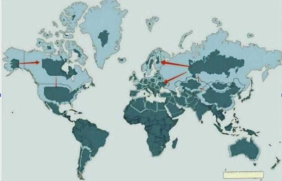
This is why Greenland can appear almost as large as Africa on a Mercator map, while in reality Africa is roughly 14 times larger than Greenland. Europe, Russia, Canada, and other northern regions are also visually enlarged, while Africa and other areas closer to the Equator appear comparatively reduced.
For navigators, this distortion served a useful purpose. But when the same map becomes the primary visual representation of the world in classrooms, it can influence how people perceive the relative size and importance of different regions. This is where the Equal Earth projection enters the conversation.
Introduced in 2018 by cartographers Bojan Šavrič, Bernhard Jenny, and Tom Patterson, Equal Earth is an equal-area projection. Its purpose is to preserve the relative areas of continents and countries. Instead of prioritizing the navigational properties of Mercator, it gives greater priority to showing how much land each region actually occupies.
It is not a “perfect” map either.
There is no perfect flat map of a spherical Earth. Every projection makes compromises involving area, shape, distance, or direction. Equal Earth distorts some shapes, particularly toward the edges, but it provides a much more accurate comparison of the physical size of continents. The difference is particularly striking when looking at Africa.
The continent is enormous. It is larger than North America and South America individually and is large enough to contain the United States, China, India, Japan, Mexico, and substantial parts of Europe within its boundaries. Yet the familiar Mercator map can make Africa appear much less imposing.
This is where the argument about perception comes into play. Whether consciously or unconsciously, maps influence how people imagine the world.
An African child who repeatedly sees Africa visually compressed may develop an unconscious impression of a continent that occupies less physical space than it actually does. A Black student studying world geography may see Europe and North America occupying much larger portions of the map while Africa appears relatively modest.
The map does not tell the child that Africa is less important. But visual representation can influence perception.
This is why Togo’s Foreign Minister Robert Dussey’s argument resonates. It reinforces the fact that maps can shape education, imagination and collective perceptions. The UN’s explanation of the resolution similarly points to the consequences of longstanding cartographic distortions for how the world is understood.
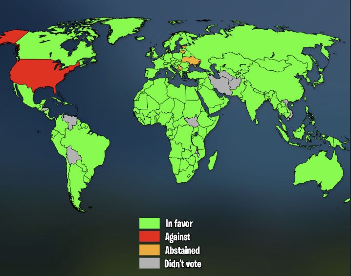
Photo source: Instagram / Geodudemaps
For Africa, therefore, this is partly a conversation about representation but also about perception.
For decades, the continent has spent time, resources and energy challenging international images that too often reduce Africa to poverty, conflict, disease, humanitarian emergencies and political instability. While these issues exist and should not be ignored, they do not tell the whole African story.
Africa is also home to enormous cultural industries, major cities, growing technology ecosystems, agricultural resources, critical minerals, expanding consumer markets and a young and rapidly growing population. A more accurate map cannot change these realities, but it can provide a more accurate starting point for understanding the continent.
There is also a political angle to this.
Togo led the campaign with support from the African Union, turning what might initially have been dismissed as a technical cartographic issue into a matter debated and voted upon by the international community. More importantly, African member states present at the UN voted unanimously in favour of the resolution.
This is significant because Africa’s influence in global affairs is not only about the number of countries it has or the votes it controls at the United Nations. It is also about how effectively African countries can coordinate around issues that affect the continent’s image and interests.
The question now is what this means for the next generation of Africans.
Imagine an African child growing up with a world map that presents Africa closer to its actual physical scale. Imagine students in Lagos, Nairobi, Accra, Johannesburg, or Cairo seeing a map that does not visually shrink the continent.
That might not automatically create confidence, prosperity, or development, but it can contribute to a more accurate perception of Africa’s place in the global community.
The economic angle is also worth considering.
Africa currently has 54 countries, the largest number of sovereign states represented by any continent at the United Nations. Its enormous geographic size matters when discussing infrastructure, trade and regional integration.
The African Continental Free Trade Area is attempting to connect economies across this vast geographic space. Moving goods from Lagos to Nairobi, Dakar to Addis Ababa or Cairo to Cape Town requires infrastructure capable of dealing with enormous distances. Roads, railways, ports, airports, logistics networks and digital infrastructure therefore represent not only development challenges but also significant investment opportunities.
Understanding the true scale of Africa makes the challenge of integration easier to appreciate.
But the map should not become a substitute for action.
Changing a projection will not build roads, create jobs, improve healthcare or education, strengthen institutions or resolve conflicts. It will not automatically give African countries greater influence in international financial institutions or global decision-making.
What it can do is correct a picture that has been misleading for generations. Africa did not become 14 times larger because of a UN vote. It has always been that large. What changed is the willingness of the international community to encourage a more accurate representation of that reality.
Perhaps that is the most important lesson from this vote.
For centuries, Africa has often been described, measured and represented through the eyes of others. Correcting the map does not rewrite Africa’s history, solve its problems or guarantee its future. But it does provide an opportunity to see the continent differently.
And perhaps Africans, particularly the next generation, should not only learn how large Africa is on a map. They should also understand the enormous possibilities that come with occupying such a vast and diverse part of the world.

Okechukwu Nzeribe works with the Onitsha Chamber of Commerce, in Anambra State, Nigeria, and loves unveiling the richness of African cultures. okechukwu.onicima@gmail.com